Ca Kho Tho
(Vietnamese Braised & Caramelized Catfish)

Recipe Page Research - Natalie Dinh
(Vietnamese Braised & Caramelized Catfish)

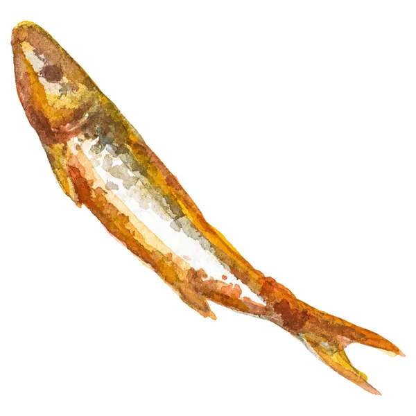
Food to nourish the Vietnamese people, a personal favorite dish of mine, it's caramelized catfish. Gently braised in fish sauce and coconut juice, this classic sweet and savory side dish is the taste of home.
Servings: 4
Cook Time: 20 mins
Inactive Time: 30 mins
Total Time: 50 mins
Fish
- 3 lbs whole catfish
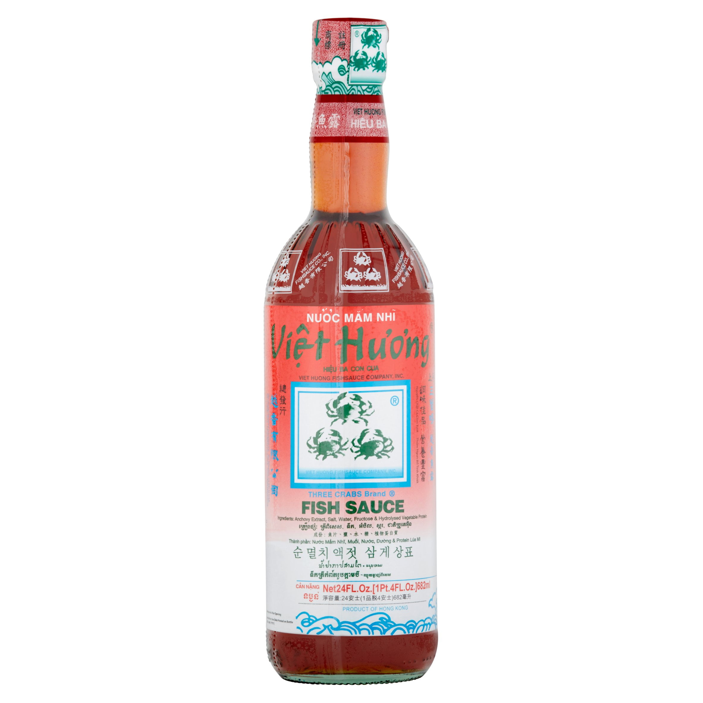
- 4 tablespoons fish sauce
- 1 tablespoon granulated sugar
Caramel Sauce
- 2 tablespoons vegetable oil
- 1 tablespoon granulated sugar
Braising Liquid
- 1 shallot (minced)
- 3 cloves garlic cloves (minced)
- ½ can Coco Rico coconut soda (6 oz)
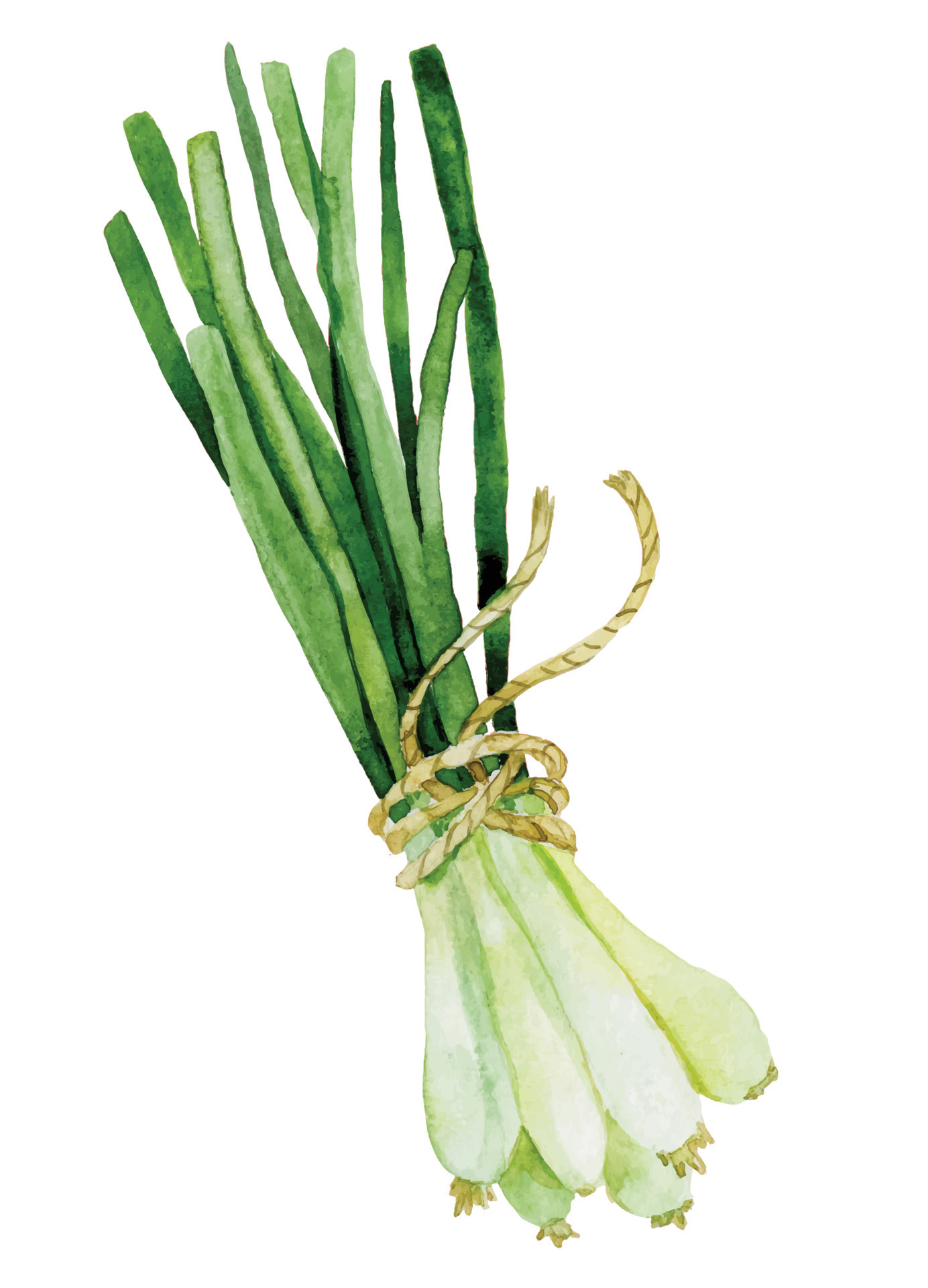
- 1 green onion (slice thinly)
- ¼ teaspoon ground black pepper

1. Prepare the catfish: Slice the catfish into 1½ inch thick steaks. Marinate the steaks with fish sauce and sugar for at least 30 minutes.
2. Make the caramel sauce: In a clay pot or skillet, heat vegetable oil on medium-high. Sprinkle a thin layer of sugar (1 tablespoon) onto the oil and heat until the sugar caramelizes to an amber color. Immediately, add shallot and garlic and sauté until fragrant (about 15 seconds).
2. Cook: Add marinated catfish and all its marinade liquid into the skillet. Flip catfish on all sides to evenly coat with aromatics and caramel sauce (color will darken while braising). Add coconut soda and gently cook on a low simmer for a total of 20 minutes, partially covered. At the halfway mark, flip the catfish so that the top gets a chance to absorb the braising liquid. If you find that the fish its too delicate to flip, spoon braising liquid over the catfish instead.
4. Garnish and serve: Top with green onions and black pepper when ready to serve.


1. Milk Street strategically uses a grid and column to break up information. It shows great attention to typograpghical detail and provides a comfortable read. I espeically like their feature of breaking up each step into a sliding card to prevent overwhelming users
(The site requires subscription access. Check out the case study here.)
2. Budget Bytes allows users to jump directly to the recipe card through interactive buttons. Users have a choice to scroll through recipe backstories and tips, jump right to the recipe summary, or follow a step-by-step with photos. User choices are put first. I like how they used a recipe card and incoporated icons into the details, such as the clock. The site is useful, allowing users to customize the recipe to number of servings. I also like how yellow is used as an accent color towards important info or buttons.
1. Mangasan is a Japanese cafe website. I like the overall art direction: the pattern backround, print paper, textured type, and illustration style is reminscent of traditional Japanese printmaking. I can utilize Vietnamese iconography into my website. I also like the card layout, which could be used to break up instruction steps. A small but effective thematic detail is the food icons that are used to navigate throughout the deck at the bottom of the site.
2. MICA uses a non-grid layout and overlapping elements to create a playful tone. I would like to mimic the overal tone with floating images. The combination of typefaces within sentences and overall scale-shifts are very effective. The mico-interactions are also very smooth.
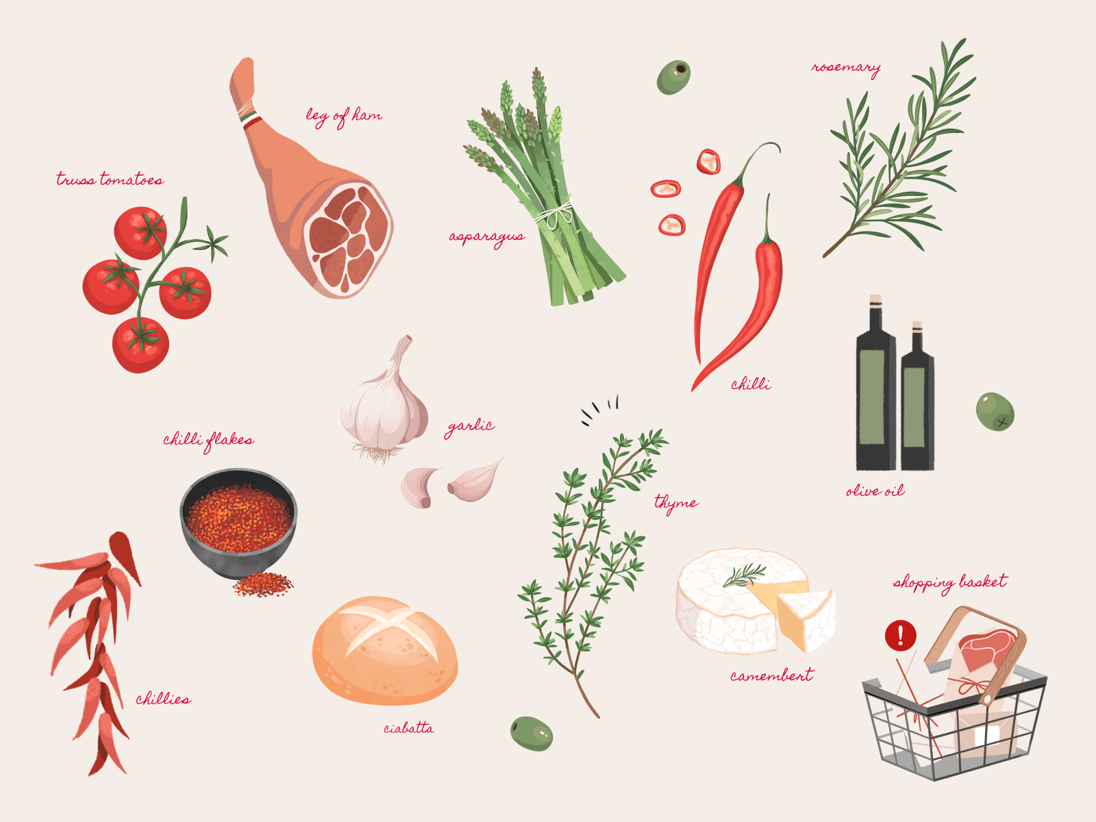
3. Amici is an Italian restaurant that features excellent micro-interactions on its site. I like the overall color palette that feels very warm and cozy, which would accentuate the homemade meal. I like how images floats into the opening page as a transition. I also like how the text appears on a card like a menu. It uses tilted images to convey a playful mood.